Let me visualise how your website looks like…
Okay, I kid you not. This visualisation thingy isn’t just empty talk. At “Websites as Graphs“, you can type in the URL of your favourite website and a little java applet will spawn a host of coloured dots representing the site’s various tags and links.
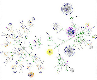
This is how my site looks like:
Blue indicates links (A tag)
Red indicates tables (TABLE, TR and TD tags)
Green indicates DIV tag
Violet indicates images (IMG tag)
Yellow indicates forms (FORM, INPUT, TEXTAREA, SELECT and OPTION tags)
Orange indicates linebreaks and blockquotes (BR, P, and BLOCKQUOTE tags)
Black indicates HTML tag, the root node
Gray is for all other tags
Exactly what purpose this visual representation serves is beyond me, but I’m sure people who are obsessed with analysing stuff will be able to tell us the point of it all.
Related posts:
Incredibly useless website (9)
Incredibly useless website (8)
Incredibly useless website (7)

