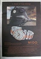
Saw this Mido ad in today’s The Standard (and it’s on the front page). Instead of “A mark of true design”, it appears more like “A mark of poor design” because the two photos do not relate to each other unless you strain your eyes to read the copy below the headline.
To make matters worse, the font used for the text (especially the whole bunch at the bottom) is too small, which makes it difficult to read against a black background. So visually, the ad is unimpressive while the copy fails to inform, hindered by poor design execution.

