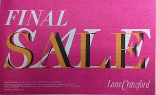
This half-page ad by Lane Crawford suffers from poor execution with amateurish use of font and font effects (oh wait, maybe they did it deliberately), and no USP mentioned. A waste of ad budget, made worse by the fact that it has been published a couple of times.


