I never make the same mistake twice. Three, four, perhap even five times – yes! But if you’re not like me and you’re into Web design, be sure to check out Vincent Flanders’ Web Pages That Suck. According to the site, 2008 was a good year for bad Web design. The worst? Havenworks.
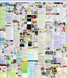
Lo and behold, if you think Havenworks is bad, wait till you see one of the contenders for 2009: Bella De Soto‘s Web Site (beware, the page takes forever to load because, holy shit, it scrolls horizontally and vertically!). If you don’t want to crash your browser, just look at the image below and you’ll get the idea.
Btw, here are the “Biggest Mistakes in Web Design 1995-2015” according to Vince:
1. Believing people care about you and your web site.
2. A man from Mars can’t figure out what your web site is about in less than four seconds.
3. Using design elements that get in the way of your visitors.
4. Thinking your web site is your marketing strategy.
5. Have you ever seen another web site? Really? Doesn’t look like it.
6. Navigational failure.
7. Using Mystery Meat Navigation.
8. Site lacks Heroin Content.
9. Forgetting the purpose of text.
10. Too much material on one page.
11. Confusing web design with a magic trick.
12. Misusing Flash.
13. Misunderstanding the use of graphics.
14. Mystical belief in the power of web standards, usability, and tableless CSS.
15. Javascript

